
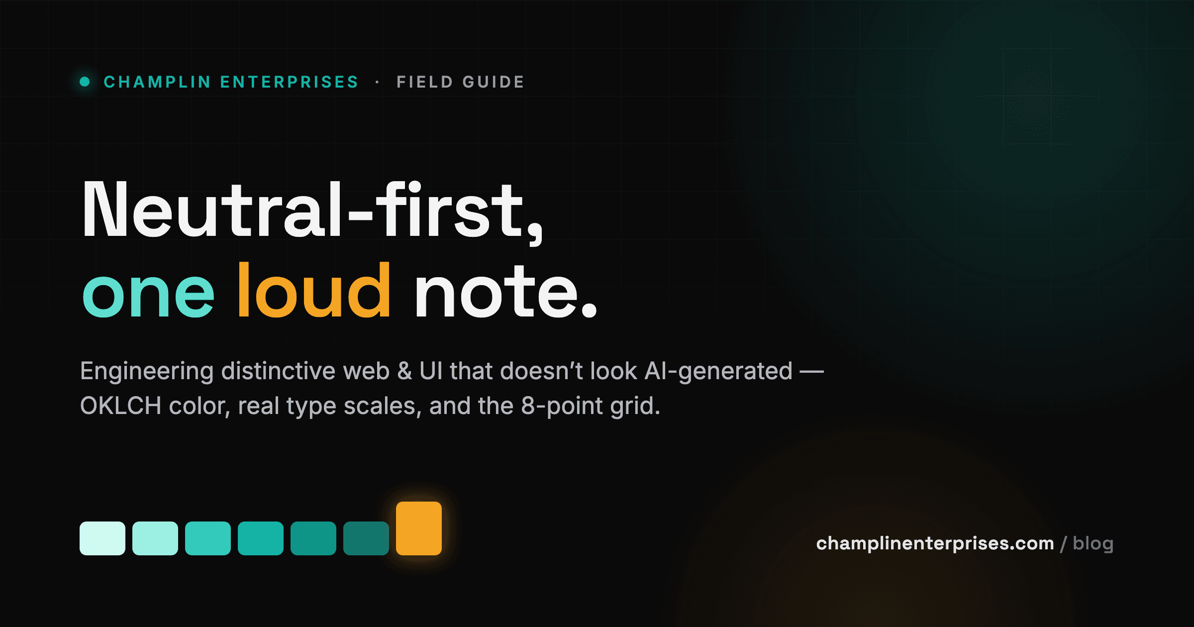
A field guide to distinctive, premium UI — OKLCH color, neutral-first palettes, real type scales, and the 8-point grid — built on one principle: restraint plus one or two intentional choices.
Every AI-Built Site Looks the Same — Here’s the Tell
You can spot an AI-built site in under a second, and so can your prospects. The purple-to-blue mesh gradient — lifted wholesale from OpenAI, Anthropic, and Midjourney branding — now coats half of ProductHunt. Pair it with a pure-black background, one neon accent, and the same centered hero you have seen a hundred times: a “Reimagine the future”-style headline, a glowing gradient blob, two buttons. Glassmorphism on every card. Stock photos and that suspiciously smooth AI-illustration sheen. It reads as competent and forgettable in the same breath.
This is the defining design tension of 2025 and 2026: a real backlash against AI-generated sameness. Users and engineers are fatigued. When every landing page reaches for the identical toolkit, the toolkit stops signaling “modern” and starts signaling “templated by a machine that had no opinion.” Here is what the cliché looks like next to work that actually holds a point of view.
The fix is not more effects. It is fewer, chosen on purpose. Distinctiveness comes from human craft — original photography, distinctive type, asymmetry, texture, an actual stance — and from the discipline to leave the rest alone.
Distinctiveness is restraint plus one or two strong, intentional choices — not neon-on-black gradients and a cliché hero.
That is the whole thesis. A real type system, a perceptually-uniform palette, generous whitespace, motion with a reason. The sections that follow build the system that produces it: OKLCH color, neutral-first palettes, contrast, typography, an 8-point grid, design tokens, and dark mode.
Build Color in OKLCH, Not Hex
Hex codes describe color the way a paint chip does — a fixed output, opaque to math. HSL feels like an upgrade because it gives you knobs, but it lies. hsl(220 100% 50%) and hsl(60 100% 50%) claim the same 50% lightness, yet the yellow looks blinding next to the blue. For a one-off background, who cares. For a systematic scale, that gap is fatal: lightness in HSL is a label, not a measurement, so any ramp you build by hand drifts.
OKLCH fixes this at the root. Introduced by Bjorn Ottosson in December 2020, it expresses color as L (lightness, 0–1, perceptually uniform), C (chroma), and H (hue, 0–360). Four properties make it the single biggest practical upgrade to a color workflow:
- Perceptual uniformity. Pick a lightness and every hue at that value reads equally bright. Generating a consistent 50–950 ramp becomes mechanical and reliable instead of eyeball-and-pray.
- No hue shift. Your blue stays blue from lightest to darkest, instead of sliding toward purple the way naive HSL
lighten()/darken()math does. - Wide gamut. OKLCH reaches into P3 and Rec.2020, so colors render more vivid on modern displays.
- Smoother gradients. Interpolating in OKLCH skips the muddy gray middle you get from sRGB blends.
This is not theory looking for a use case. Tailwind v4 ships its entire palette in OKLCH for exactly these reasons.
In OKLCH, a color ramp is something you calculate, not something you nudge until it looks right.
The recipe from Evil Martians is worth stealing: fix a per-step lightness array, then pick a chroma with no gaps across the hue spectrum at each step, pulling chroma back at the extremes so the lightest and darkest shades don’t look radioactive. A 20–30 degree hue shift toward warmth or coolness at the ends is the pro touch. Here is a teal primary built that way, 50 through 950.
Generators worth knowing while you work: oklch.com, the Tailwind v4 palette tools, Coolors, and Atmos.
Great Interfaces Are Mostly Neutrals
The beginner instinct is to chase the brand color. You pick a hero blue, fall in love with it, and start painting it everywhere. That is exactly backwards. You cannot build a real interface from five perfect swatches — Wathan and Schoger make this point in Refactoring UI, and Nathan Curtis’s design-systems work at EightShapes proves it at scale. A working palette is mostly scaffolding.
Here is what a real one needs: 8–10 grays carrying text, backgrounds, panels, borders, and form controls; one — maybe two — brand colors, each with 9–10 shades; accent colors used sparingly; and semantic colors for success, warning, error, and info, each typically wanting a light tint, a mid, and a dark variant. That is dozens of values, and the grays do the heavy lifting.
Two rules separate premium from amateur. First, never use pure black or pure white for large areas. Pure black on white runs 21:1 — harsh, halo-inducing, eye-straining, and frankly cheap-looking. Reach for a near-black and an off-white instead. Second, tint your grays toward your brand hue. Warm grays lean red and yellow; cool grays lean blue. Flat grayscale “doesn’t exist in nature and may seem unnatural.” And avoid muddy medium grays — nothing reads accessibly on them, and they produce that wireframey look.
Temperature is a brand decision. Warm neutrals feel human, editorial, inviting; cool neutrals feel technical, clean, corporate.
Now the proportions. The 60-30-10 rule: 60% dominant neutral, 30% secondary, 10% accent — the brand color, reserved for CTAs and emphasis. In a real UI the brand color is never the most-used color.
People judge a product within 90 seconds of first view, and 62–90% of that judgment rests on color alone (Institute for Color Research). Think Netflix or Target: mostly neutral, with one signature red splash.
Contrast Is the Floor — and Most Sites Fail It
Contrast is the most basic accessibility decision your interface makes, and it is the one most teams get wrong. The WebAIM Million report — a February 2026 analysis of the top one million home pages — found low-contrast text below the WCAG 2 AA threshold on 83.9% of pages, up from 79.1% a year earlier. It is the single most commonly detected accessibility failure, averaging 34 instances per page. This is not an edge case. It is the default.
The bar itself is not aspirational. WCAG sets 4.5:1 for normal text and 3:1 for large text (24px, or 18.66px bold) as the AA minimum. Interactive boundaries count too: input borders, button edges, meaningful icons, focus rings, and chart elements all need 3:1 against what sits next to them under 1.4.11. Below is how common color pairings stack up against those lines.
There is a moral case and a financial one, and they point the same direction. Color-vision deficiency affects 1 in 12 men and 1 in 200 women — roughly 300 million people who cannot lean on hue to decode your interface. That is why 1.4.1 exists: never let color carry meaning alone. Pair it with an icon, a label, or a pattern.
The financial case arrived in law. The EU’s European Accessibility Act entered into force on 28 June 2025, with national penalties reaching EUR 100,000 per violation or 4% of annual revenue under regimes like Germany’s BFSG. In the US, the ADA already governs.
WCAG is the floor, not the ceiling — a 4.52:1 pass can still strain some users. Treat the minimums as a starting line, not a finish.
Ship contrast as code, not as a design review note. Verify with the WebAIM Contrast Checker or TPGi’s analyzer while designing, then enforce it with axe-core, Pa11y, or Lighthouse in CI so a regression fails the build, not the audit.
Typography Is Your Highest-Leverage Decision
Before you reach for a gradient or a glass card, set your type. One excellent typeface used with a clear modular scale, the right measure, and proper line-height beats any decoration you can layer on top. Type is the interface — it occupies more pixels than anything else on the screen, and it is the cheapest thing to get right.
Start with measure, the length of a line. Bringhurst puts the sweet spot at 45–75 characters, with roughly 66 as the classic ideal — one line of CSS, max-width: 66ch. WCAG 1.4.8 caps you at 80 for a reason: past that, the eye loses its place on the return sweep. Then set line-height: body copy wants ~1.5–1.6, headings tighter at ~1.1–1.3, because large type needs less leading. Never ship primary body text below 16px, and express it in rem so a user’s zoom and browser settings are respected.
Hierarchy comes from size, weight, and color — not from a drawer full of typefaces. That is why a modular scale earns its keep: pick a 16px base and a ratio, and every size downstream is deliberate. Use 1.125 (Major Second) for dense dashboards, 1.250 (Major Third) for marketing, 1.333 (Perfect Fourth) when you want strong hierarchy.
For the family itself, Inter — Rasmus Andersson’s screen-tuned grotesque with a tall x-height — is the de facto SaaS default for a reason; Linear, Notion, Figma, and GitHub all run it. Geist, Plus Jakarta Sans, Manrope, and Hanken Grotesk are equally credible workhorses. Favor a font with 5+ weights, and ship it as a variable font: every weight and axis in one file, smaller total payload, finer control. Self-host or preconnect, subset your glyphs, and set font-display: swap.
Two families is the ceiling — one for headings, one for body, and a mono accent only if you must. Anything more is decoration pretending to be design.
Systematize Everything: the 8-Point Grid and Design Tokens
The difference between a design system and a pile of CSS is that a system has rules you can’t quietly break. Two rules carry most of the weight: every size and space lands on a grid, and every value has a name that explains why it exists.
The 8-point grid
Size and space everything in multiples of 8 — 8, 16, 24, 32, 40, 48, 64, 80, 96 — with 4px allowed as a single half-step for tight gaps like icon-to-label. Eight wins because it’s cleanly divisible, scales without fractional pixels across device pixel ratios, and matches the dimensions of most screens. Both Apple and Google build on it.
Pair the 8pt UI grid that governs layout and components with a 4pt baseline grid for text rhythm: set line heights to multiples of 4 so type sits on a consistent vertical beat. Here’s the spacing scale we hand to every team, built on a 4px base.
One rule keeps groups reading as groups: internal <= external. Padding inside an element should be less than or equal to the space separating it from its neighbors, so Gestalt proximity does the grouping work for you.
Three tiers of tokens
IBM Carbon, Material, and Salesforce all converge on the same architecture:
- Primitive tokens — raw values named for what they are:
blue-500,space-4. - Semantic tokens — map primitives to intent:
color-primary,color-text-secondary,color-surface-raised,color-danger. Name for why, never what —color-text-error, notcolor-text-red— so the value can change without breaking the name. - Component tokens — component-scoped:
button-primary-bg,input-border-focus.
Components reference semantic tokens; you re-map semantic to primitive per theme. That single layer of indirection is what makes light/dark, multi-brand, and large refactors safe instead of terrifying.
Dark Mode, Done Like You Mean It
The most common dark-mode mistake is the most tempting one: paint the background pure black and call it premium. It reads as cheap. Pure black causes blooming and halation around text, and it leaves you nowhere to go — every surface above the base has to be lighter, and you’ve already hit the floor. Start instead on a dark gray or near-black around L 8–12%. Material lands on #121212; the deep navies that give premium SaaS its weight sit at #0d1117 or #0f172a.
The real discipline is how you express elevation. On a light canvas, shadows lift a card off the page. On dark, shadows are invisible — there’s nothing darker to cast against. So you stop reaching for shadow and reach for light. Each step up the stack gets roughly 3–5 lightness points brighter: base at L~10–12%, sidebar at 14–16%, card at 17–20%, drawer at 22–26%, popover up at 26–30%. Material 2 encoded the same instinct as white-overlay percentages on #121212 — 1dp at 5%, 8dp at 12%, 24dp at 16%. Material 3 later swapped overlays for a tonal surface system, so treat those numbers as a ladder of relative steps, not scripture.
On dark, elevation is lightness. The higher the surface, the brighter it glows.
The chart below walks that ladder rung by rung.
Two more moves separate polished from default. Desaturate and lighten your accents — a blue that sings on white turns aggressive on dark. And soften your text: skip pure white for #E2E8F0 or #F1F5F9, and lean on opacity tiers (~87% high-emphasis, 60% medium, 38% disabled). Drive all of it through semantic tokens so light and dark are two mappings of one intent, and respect prefers-color-scheme.
A Drop-In Tailwind v4 Theme You Make Yours in One Number
Everything above pays off in one place: a CSS-first @theme block you can paste into a fresh Tailwind v4 project today. There’s no tailwind.config.js to wire up. Each token you declare becomes a CSS custom property, generates the matching utility classes, and stays readable at runtime — including --spacing, the single base unit the whole spacing scale derives from.
The theme below isn’t the generic starter look. The neutrals run from a warm off-white to a near-black ramp instead of cool gray. The primary is a confident teal — OKLCH hue 187 — rather than the indigo-and-purple that ships on every other site. A warm amber carries the accent. Defined in OKLCH, it matches Tailwind’s own palette math and reaches into P3 for vividness flat sRGB hex never gives you.
@import "tailwindcss";

@theme {
  /* NEUTRALS — warm-tinted, never pure #000/#fff */
  --color-ink-50:  oklch(0.98 0.004 80);
  --color-ink-100: oklch(0.96 0.005 80);
  --color-ink-300: oklch(0.86 0.007 75);
  --color-ink-500: oklch(0.58 0.009 65);
  --color-ink-700: oklch(0.38 0.011 55);
  --color-ink-900: oklch(0.20 0.012 45);
  --color-ink-950: oklch(0.15 0.012 45);   /* near-black text */

  /* PRIMARY — deep teal, hue 187 (not indigo) */
  --color-primary-300: oklch(0.79 0.10 191);
  --color-primary-500: oklch(0.62 0.13 187);  /* button background */
  --color-primary-700: oklch(0.44 0.10 185);
  --color-primary-900: oklch(0.28 0.06 185);

  /* ACCENT — warm amber, used sparingly */
  --color-accent-500: oklch(0.76 0.16 65);

  /* SEMANTIC */
  --color-success-500: oklch(0.65 0.15 150);
  --color-warning-500: oklch(0.80 0.13 85);
  --color-danger-500:  oklch(0.60 0.20 27);

  /* TYPE */
  --font-sans:    "Inter", ui-sans-serif, system-ui, sans-serif;
  --font-display: "Fraunces", Georgia, serif;
  --text-base: 1rem;     --text-base--line-height: 1.6rem;
  --text-3xl: 2.441rem;  --text-3xl--line-height: 2.5rem;

  /* SPACING (4px base) + RADII */
  --spacing:    0.25rem;
  --radius-md:  0.5rem;
  --radius-xl:  1rem;

  /* MOTION */
  --ease-out: cubic-bezier(0, 0, 0.2, 1);
  --ease-in:  cubic-bezier(0.4, 0, 1, 1);
}

/* Dark mode: remap surfaces by lightness, not shadows */
@layer base {
  .dark {
    --color-bg:             oklch(0.17 0.012 250);
    --color-surface:        oklch(0.21 0.012 250);
    --color-surface-raised: oklch(0.25 0.012 250);
    --color-text:           oklch(0.93 0.005 250);
    --color-border:         oklch(0.30 0.012 250);
  }
}
One file carries the full system: the neutral ramp, the primary ramp, the accent, semantic colors, type, spacing, radii, shadows, and motion easings — every one a token, every one available as a variable and a utility.
Here’s the part worth keeping. The primary is teal only because hue 187 says so. Change that single number and the entire 50-through-950 ramp re-derives in balance, because OKLCH holds lightness and chroma steady while hue rotates.
Set the primary to 25 and you have terracotta. 300 gives you magenta, 145 gives you emerald — and you never touch a second line.
That’s the whole argument for going CSS-first. The palette becomes yours in one number, and the system stays balanced while you do it.
The Last 20% Is Human
Strip the best-looking products down and the same skeleton appears every time: high contrast, abundant whitespace, a near-neutral foundation, one disciplined accent, and sharp, often custom type — executed so consistently the result feels inevitable. Stripe commissioned Söhne and built a brand around #635BFF. Vercel commissioned Geist. Linear committed to a single desaturated indigo and never blinked. The formula is real, and most of it is now reproducible at speed.
But the formula is also where the trap is. Dark surface plus one neon accent has already calcified into the new house style — the new blue for trust. Copy the surface and you arrive looking like everyone who copied it first. The leverage is in the principles, not the palette: take the contrast, the restraint, the real product imagery, the custom-feeling type, and then make your own choices about temperature, color, and personality.
AI gets you to 80% in an afternoon. The last 20% — the choices that give a product character — is still a human decision.
That last 20% is craft you can systematize: tokens, a type scale, a contrast model, a coherent palette held across every screen. It’s the layer that makes a product feel like one person built all of it. That systematic layer is exactly what Champlin Enterprises engineers into the products it ships. If you want that discipline applied to yours, start a conversation.